
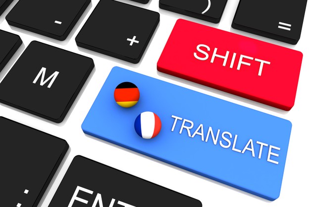
When you create a website, it’s always an excellent idea to have the content translated to at least one more language, so you can increase the audience and pageviews. Multilingual websites are becoming more and more common and demanded, especially for those who sell something and offer shipping all around the world. Adding a new language is easy – you only have to find the right automated translator, since hiring someone to translate the whole content will consume hours or days of work. But, surely you will have plenty of benefits if you do that, and get the wanted support from different language speakers. Conveythis offers automated translation of everything you want – the whole website, or just some particular sections. It’s on you to choose.
So, while we are here, let’s see some tips on how to build a successful multilingual website:
1. The same template for all language versions

It seems like an interesting idea to have a different design for every language, but believe us that no one finds it interesting anymore. You can only include the colors of the flag, but keep the branding the same, no matter the audience you want to attract. That means, everyone who visits your website, no matter where they come from, will see the same version. The only difference should be the text. That’s the key part to be consistent for all your audience. After you integrate the translator, you can choose from the supported languages, and set it right, so the visitors can choose their preference when it comes to language offers.
2. Use the same domain

To keep the website design consistent, you can choose to have a few domains or different pages for every language. We highly recommend using the second one. That means when the user chooses the language, they are accessing the basic domain, in this form: website.com/ru for Russian, website.com/fr for French, website.com/de for German, and so on. Some companies and providers choose to use different domains but keep in mind that those are different websites, and the visits are not focused on the basic one. From the branding aspect, it’s better to choose the initial domain and include the different versions of the website as pages. It’s better for the whole branding strategy to be consistent, and you can do that with a single website. And while we are here, be careful when choosing the hosting provider and the hosting package. Don’t go for the most expensive plan immediately, because you can always migrate to it if the number of visitors starts growing rapidly.
3. The language switcher must be visible
The users should see that you offer different language options, so it’s nice to make it completely visible to the visitors. They need to find it and choose the appropriate language option for them. The most anticipated way to do that is to put it above the menu label, or in the header, and choose the shortcodes of the countries, or the national flags. If it’s too basic for you, you can go for dropping menu, with the list of available languages. Many designers choose to put an icon that is a simplified version of the Earth, which is a sign for “global”, and the users can click there and find their preferred language. But, in this case, you can start with what you prefer most when you visit multilingual websites alone.
4. Let the visitors choose their region
Many websites are doing this. You open the basic URL, and then you are choosing the preferred region. After that, the system navigates you to the page you request. For example, people in South America speak Spanish and Portuguese, and you can set it as a default language for that region. Also, it’s always nice to have separate versions for American English and British English, since there are plenty of differences in the vocabulary. Also, don’t consider that all the Slavic countries speak Russian, especially in the Balkans, since their languages are pretty different. The Cyrillic letter doesn’t mean that everyone who is using it is speaking the same language. You must be very careful with that. Always let them an option to choose the basic version of the website, especially if it’s English, because, as you know, a lot of people in the world already know it and actively use it for communication.
5. Know the language specifications

You must adapt the design to this. Sometimes, when the original text is translated to another language, it can appear longer or shorter. That’s because the languages have different specifications. For example, German is known for long words, and while in English it’s “pen”, in German would be “Kuegelschreiber”. So, you see what we are trying to explain. Don’t limit the design, because the translated text can be much longer than the original. Many languages are very wordy and may take 20%-30% more space than the original content. On the other hand, languages like Arabic, Chinese, or Japanese, need less space, so you can set a bigger font, so the website won’t look empty.
6. Choose a nice font and encoding
Also, don’t forget to turn on the UTF-8 encoding, so the design can recognize the specific signs and letters. If you don’t do that, they would appear like empty squares or blank spaces. The design must be compatible with every language, and you must check that with the developer who is working on the design, especially if you want to put more specific choices there.
Multilingual websites aren’t something new. There are plenty of them, and you, as a visitor, probably already have accessed some of them. It’s good for your overall branding strategy to have a plan to access a larger audience, but you must be ready for that. Don’t put some language if you don’t cover the service in a particular country. But, if you have a news website, you can do that, so the foreign visitors can read interesting things. If you have an e-commerce website, choose the languages of the countries you ship the products to.


