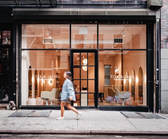
Italian pink marble lines the soothing interiors of the Fox & Jane Salon in New York City’s Lower East Side. The space was renovated by interior designer Ariana Grillo with construction by NPA Design to create a posh, uplifting environment for the salon’s guests. Since its founding in 2011, Fox & Jane has emerged as one of the city’s leading hair studios known for its cutting edge looks and trend-setting styles.
Being a fast-growing brand of hair salons in New York, Colorado, New Jersey and Toronto, Fox & Jane Salon thrives for its talented artists and culture. Their brand stands out for its inclusivity, its community and love for great hair. From a graphic perspective, it focuses on pastel colors, gradients and bold fonts to create an inviting, accessible and fun aesthetic – which Grillo took into consideration when designing their new salon in LES.
The goal was for the studio to stand out from the rest of the stores in the neighborhood so when deciding on a color scheme, opting for a muted & beautiful pastel pink that would be an attention grabber at first sight from the big storefront windows was key. The pink was used to cover both walls and other surfaces in the salon. A matching pink tile in square format was used throughout the design to add texture and make wet spaces still functional. We tend to associate pink with lightness, grace, and a sense of renewal. In a muted form, it’s a popular, pared back shade that works the same way as a neutral. It also happens to be the brand’s signature color.
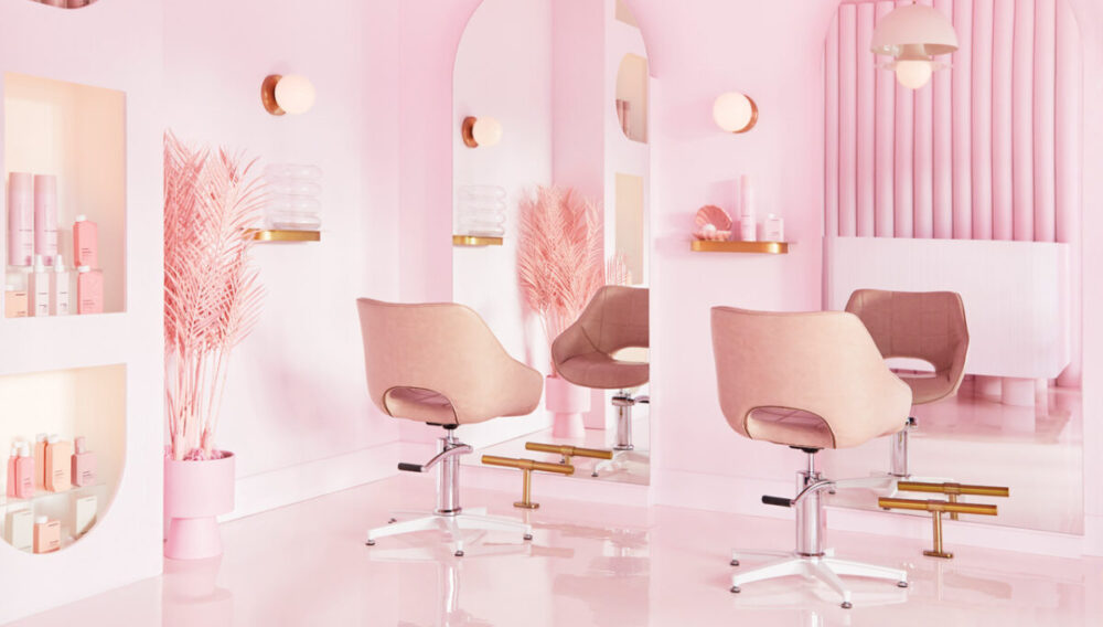
The LES studio is located in a former art gallery with beautiful concrete floors. Grillo wanted to keep the industrial aspect while giving the space a modern, timeless feel. She created an open-concept space using the existing two-floor layout with the main floor dedicated to guest services like styling and reception, while the bottom floor is reserved for staff complete with washing stations and a break area.
It was designed to accommodate the stylists’ workflow while helping the management make the most of the space. Grillo spent time analyzing how the staff moves through the space to get a better sense of their needs. The 750 sq. ft. first floor has limited space which was also one of the reasons why Grillo decided to place the reception “behind” the styling stations, instead of at the front. In order to make the reception still stand out Grillo knew she needed to use an interesting and colorful Italian marble that would create that statement moment in the room. Regardless of the location of the reception, it’s still one of the first things you see in the salon when you come in. The change opens up the salon for the guests while giving the stylists more room to do their work. The layout and equipment allow for a more streamlined and effective process, ultimately resulting in a better experience for clients.
Grillo and her team filled the studio with delicate touches meant to put the guests’ cares at ease. Aside from the natural hue of the marble which gives the salon an ethereal quality, the frameless mirrors and the round, “halo” style wall sconces along with the light colored chairs give the space an extra touch of airiness while maintaining the character it needs. Geometric shapes were an important element of the design to make it last for many years to come. The windows fill the studio with natural light with subtle recessed lighting for a more intimate guest experience.
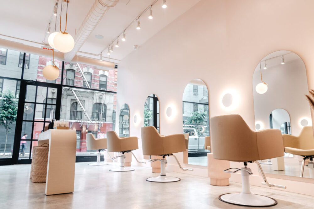 “We went with timeless pieces that would feel unique but still current for many years, there’s something soothing and harmonious about combining such pieces in one single space.” the designer told us.
As always, black is also one of the most important components in Grillo’s designs. She knows that a percentage of grounding contrast is needed in almost any functional design. “Black will give you flexibility when it comes to combining an specific palette as well as help you highlight the non-dark elements of the space” she told us. In this case, she used black for the entire storefront as well as a few decor pieces such as the benches and hardware.
When it comes to the decor, the designer kept it minimal which is something that she usually tries to achieve by implementing designs with lots of personality and vibrancy. In this case, only a few gold and clay pieces were needed to bring everything together. The brass is always an element that would elevate any composition and make it a touch more elegant while the clay speaks to the earthiness of the palette. Finally, dried plants decorate the entire salon which perfectly matches the beige & brown hues of the salon.
Grillo set out to honor the theme of the salon, which is all about innovation and empowerment. The minimalist edges and modern furniture keep the viewer focused on the details that matter while keeping the space approachable. There are hardly any cords or brushes lying around. The room is spare and clean, just as the original owners intended.
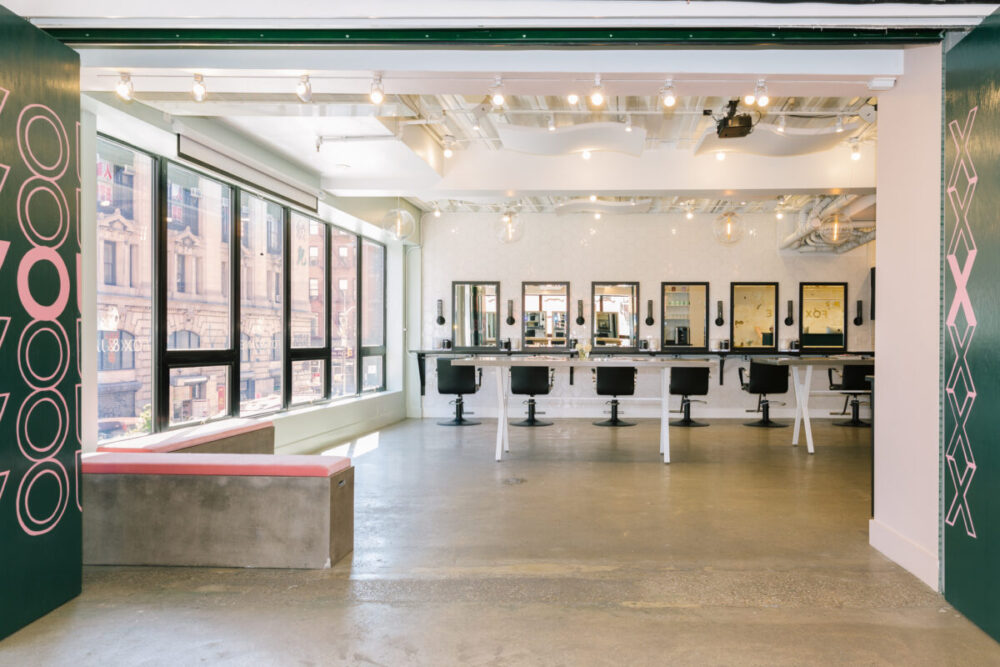
The design implementation of Fox and Jane Salon has undoubtedly had a significant impact on both the aesthetics and functionality of the space. The sleek and modern design has created a welcoming and relaxing environment for customers, while also improving the overall efficiency of the salon. Not only does the new design provide a comfortable and visually appealing atmosphere for customers, but it also enhances the services provided by the salon. By investing in high-quality elements, the salon has demonstrated a commitment to providing exceptional service and ensuring customer satisfaction.
Overall, the redesign of Fox and Jane Salon is a testament to the power of great design in impacting businesses and retaining customers. In a highly competitive industry such as beauty, specifically in New York City, creating a visually appealing and efficient space is the key to success.
Fox & Jane is the brainchild of Lorean Cairns, one of NYC’s most in-demand hairstylists, and Billy Canu, the marketing guru behind the branding initiative Better Future in Southern California. The company now has several locations across the U.S. with over 150 team members.


