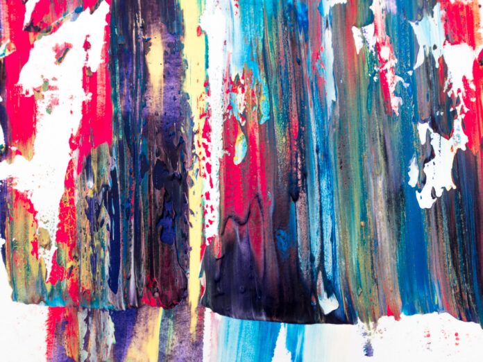
All across the globe, colour holds meaning. For thousands of years, different cultures have experimented with colour in their practices, attributing purpose and substance to hue, creating one of our most powerful symbolic tools. For example, a bride typically wears white to her wedding, and funeral guests are expected to dress in black.
As someone who’s grown up in the Western World, my perceived ideas and experiences on colour are limited, so I’ll be solely focusing on the Western World’s application of colour. In particular, how colour is used in contemporary art. Whether you’re listening to music, watching a movie or even reading the news, colour and its perceived notions are at play. I hope my observations on colour encourage you to dig deeper into texts, or inspire you to try wielding bold colours yourself. So, let’s spin the colour wheel and see what we find.
White
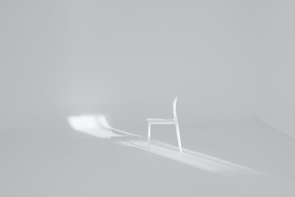
White usually serves as a blank canvas for creatives to put their work on, but there’s actually plenty to be said about the inoffensive colour. White represents a certain purity and cleanliness, potentially influenced by the characteristics of angels in the bible. White also represents innocence, as white bears no scars. No story. In a hospital setting, white can appear cold and clinical. Emotionless and unforgiving. Many artists also use white to create a sense of open space. Picture a cliff in front of endless white skies. Missy Higgins titled her debut album, The Sound of White. I believe she used white to describe her songs of heartbreak because heartbreak often results in feelings of emptiness and aimlessness.
Black
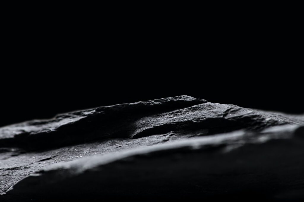
On the opposite end of the spectrum, we have black. Black is a severe, dramatic colour that’s very popular in today’s contemporary arts. When dressed in black, one conveys an aura of sophistication, formality, and even mystery. Every spy movie ever is a good reference point here. I also think of the genre film noir, in which the characters are classy, but extremely shady. However, black also represents death, darkness and power. Shadows and dark rooms are bountifully used in cinema to represent impending danger.
Red
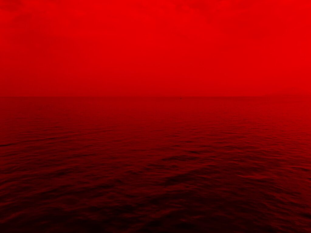
Red, another powerful colour, is used to represent a myriad of human experiences and emotions. The human body already gives us plenty to go off. When we endure pain and bleed, our blood runs red. When we feel embarrassed, our cheeks go red. Ultimately, red is a passionate colour, used for only the most intense of circumstances. These circumstances also involve feelings of love, desire, passion. For example, we need to look any further than Sam Mendes’s film, American Beauty, in which the subject of desire is continuously depicted swimming in red rose petals.
Yellow
Yellow is a vastly underrated colour. It’s a colour that optimistically points to the future. The sunrise marks a new day and a fresh start. It’s the colour of gold and wealth, a gateway to opportunity. Coldplay’s breakout hit, Yellow, uses the term to signal an imagined hope and a better life beyond the coldness of reality. “Look at the stars, look how they shine for you, and everything you do. Yeah they were all yellow”. The TV show How I Met Your Mother also uses yellow to represent the protagonist’s future wife.
Blue
Blue is difficult to pinpoint. It commonly tops lists for the world’s favourite colour, and yet it represents so many contrasting ideas. For some, blue represents peace, calmness, clarity—even conservatism. But on the other hand, blue is a colour of deep sadness and isolation. Storyteller and renowned folk artist Joni Mitchel titled her breakup album, Blue, siding with the latter.
Green

So much of our world and its life is green, making it an easy colour to connect with. Green symbolises nature, growth, and the natural state of things. Interestingly, green can also take a darker tone. Many movies utilise green as a form of ickiness, jealousy or poison. Disney Pixar’s animated film Inside Out featured an ensemble of emotions, all represented by a different colour. The character of ‘Disgust’ was painted a sickly green.
Purple
Purple has fallen in and out of popularity on the colour wheel, however the colour is still heavily embedded with meaning. Back in the days of kingdoms and empires, purple was a difficult and costly dye to produce. This made it a favourable option amongst nobles and the higher class, representing wealth and royalty. However, because purple isn’t commonly seen today, it’s become quite a polarizing colour. Some creatives love to experiment with it, and others stay well clear.
Pink
Pink is definitely hard to ignore. The bright colours most common interpretation is found in traditional gender representation, responsible for identifying female babies. However, in art, pink is used as a stimulant, representing energy, fearlessness and brightness. The Pop Art movement commonly used pink in its bold designs, making it a trendy colour for creatives with kindred spirits.
Orange
In the colour wheel, orange rests between yellow and red. We’ve observed that yellow is optimistic and red is passionate, so where does that leave orange? Well, orange is the attention grabber. It’s such a vivid, expanding colour, so we often see it in art to represent warnings or excitement. Let’s take a look at some DVD cover artworks. For Disney’s Brave, the protagonist’s wavy orange hair is placed front and centre, signalling excitement and movement. For Christopher Nolan’s Dark Knight, the iconic Batman signal pierces through the night sky in a blazing orange.
Brown
Brown bookends our look into colour and art because it represents the home ground. Brown is familiar and reliable. It’s the earth you tread on in the day, and the worn-out couch you resign to at night. It’s not thrilling, but it’s reliable and comforting. In paintings, it’s the colour of a wood-built house, or the rolling plains that the subject sits on. It’s a constant, there to support and contrast the bolder colours.
For more arts and culture-based news, check out Happy Mag here.


